I love the challenge of working on character designs. Just like casting for a TV show or a movie, selecting the right look for your characters can either enhance or distract from the story you are trying to tell. Below is some of the process I went through in developing the lineup for a comic I'm working on about cats. There's more to the story than felines but I'm purposefully keeping the subject of the story vague for right now.
When I'm working on character designs I usually start off with a fuzzy mental image that I then try to put into concrete form on paper. The above group is my first stab at the cast of supporting characters. L->R there is a biker couple, an otaku, a retired college professor, and a family inspired by the Cosby show. Decent ideas but none of these made it past the first round of designs except for the biker dude.
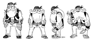
During the first edit in my story I changed the biker character from a stern person into a friendlier personality. I tried to show this off by giving him a fuller beard to allude to Santa. Although this group is more in key to the final style I picked for the comic, I didn't feel like this look was working.

This is the final to last sketches I did for the biker. During a second edit I changed the story so that this friendly character was at first perceived to be mean by the main character. I made him "scarier-looking" by shortening the beard, adding more black and a kerchief to create a horizontal line on the forehead to suggest a stern expression. The drawing on the left was the first one I did where I felt I was approaching the final character design. The sketch on the right is the one I drew after right after and it was at that point I felt as if I was "introduced" to the actual character. This sounds cheesy but I believe I don't design characters, I sketch until I "discover" them. For me there is an instant recognition when I draw a character right for the first time, I get a sudden feeling of "THAT'S IT!" Anyway, the right image I redrew to put it on model with the style of the protagonist and that is what went into the final lineup. (Sorry, that lineup not shown-that art is under wraps while I work on the comic)

The above sketches are the finished designs I did for two of the main characters. I was happy enough with their look that I started
thumbnailing out the first section of the book with them. I ended up scrapping those pages along with these two when I did a major story edit. The mom character on the right survived but now looks different. The granny character on the left was merged with a supporting character to help cut down unnecessary subplots in the story.


No comments:
Post a Comment